Visiting the Gutenberg Museum in Mainz, Germany was a bucket list experience for me. I’d been at WordPress VIP for four years and the block editor in our CMS is called Gutenberg, so I kept trying to get them to host one of our team meetups close enough for us to visit the museum.
In March, we had a product team meetup in Berlin and a Lufthansa strike meant I might not make my connection home through Frankfurt. So I canceled that first flight and took a train to Frankfurt, leaving at 6am so I could spend a few hours in Mainz.
Why did this mean so much to me? After college, I worked with magazines and four-color CMYK printing. But really, it all started with a tour of Marvel Comics.
My dad wrote Stan Lee a letter asking for a tour of their offices for my 11th birthday. That Friday, instead of going to school, my dad, my sister and I rode the subway into Manhattan and we spent the day on the 6th floor of 575 Madison Avenue meeting artists and writers and editors. It was a surprise, but I clearly remember figuring out what was about to happen because the floor indicator over the elevator door had a picture of Spider-Man’s face on it for the sixth floor. Wow.
Besides dozens of free comics, two things I got that day that changed my life were John Buscema and Stan Lee’s book “How to Draw Comics the Marvel Way,” which taught me how to draw, and an acetate overlay from an ad for Elric that was drawn by P. Craig Russell. There were four acetate sheets, each with one of the yellow, magenta, cyan and black layers, stapled on top of a white cardboard backing. So you could flip them up and down and see how CMYK brings to life a fully-colored picture. It blew my mind.
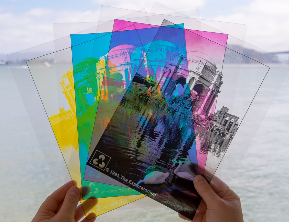
After college, I worked in desktop support for magazine companies: running Novell servers, fixing printers, troubleshooting fonts in Quark XPress. Soon, I got to be an art director myself and create magazines with my friend Jason. Other friends of mine like Glenn worked in digital pre-press and their offices had posters like “Whoever Dies With the Most Fonts Wins” and external hard drives full of fonts.
That’s how I got publishing in my blood, all before the web happened and CMYK gave way to RGB.
Around the time of my museum trip, Matt recommended a book by Matthew Butterick called Practical Typography. One of the great things about Automattic is that when they recommend a book, everyone in the company can buy it and expense it. We support creators and publishers in so many ways.
Butterick’s book is fantastic and claims to explain typography in ten minutes, which is bold. Even more bold was his claim that he can do it twice:
All it takes is ten minutes: five minutes to read these rules once. Then five minutes to read them again.
So March was a magical month for me, and had me thinking a lot about publishing history from NYC in the ‘90s all the way back to the 1400s.
And here I was, finally at the Gutenberg Museum.
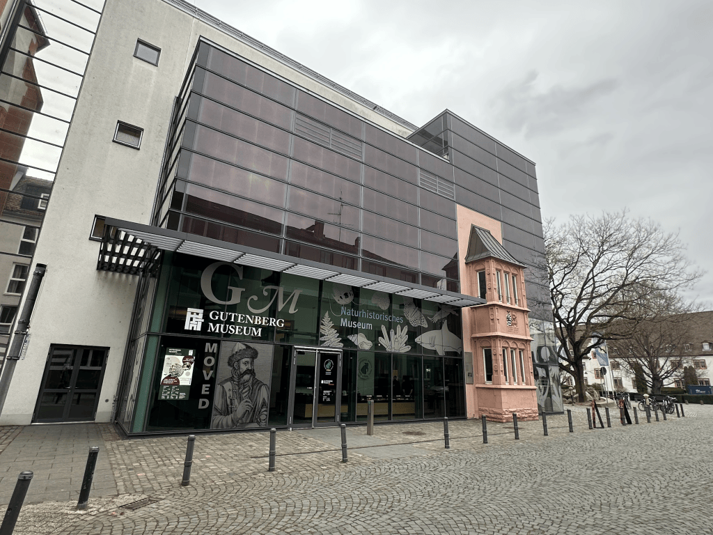
Around 1450, Johannes Gutenberg created the first printing press. It used small interchangeable cast metal letters to transfer each line of text onto a page. Much of the typography terminology we still use today is from the Gutenberg days: leading, logotype, ligatures, upper case and lower case.
Before Gutenberg, scribes copied books by hand on scrolls and paper, or print-makers printed texts from hand-carved wooden blocks. Either process took a long time; even a small book could take months to complete. Because carved letters or blocks were flimsy and the wood susceptible to ink, the blocks had a limited lifespan. — Wikipedia
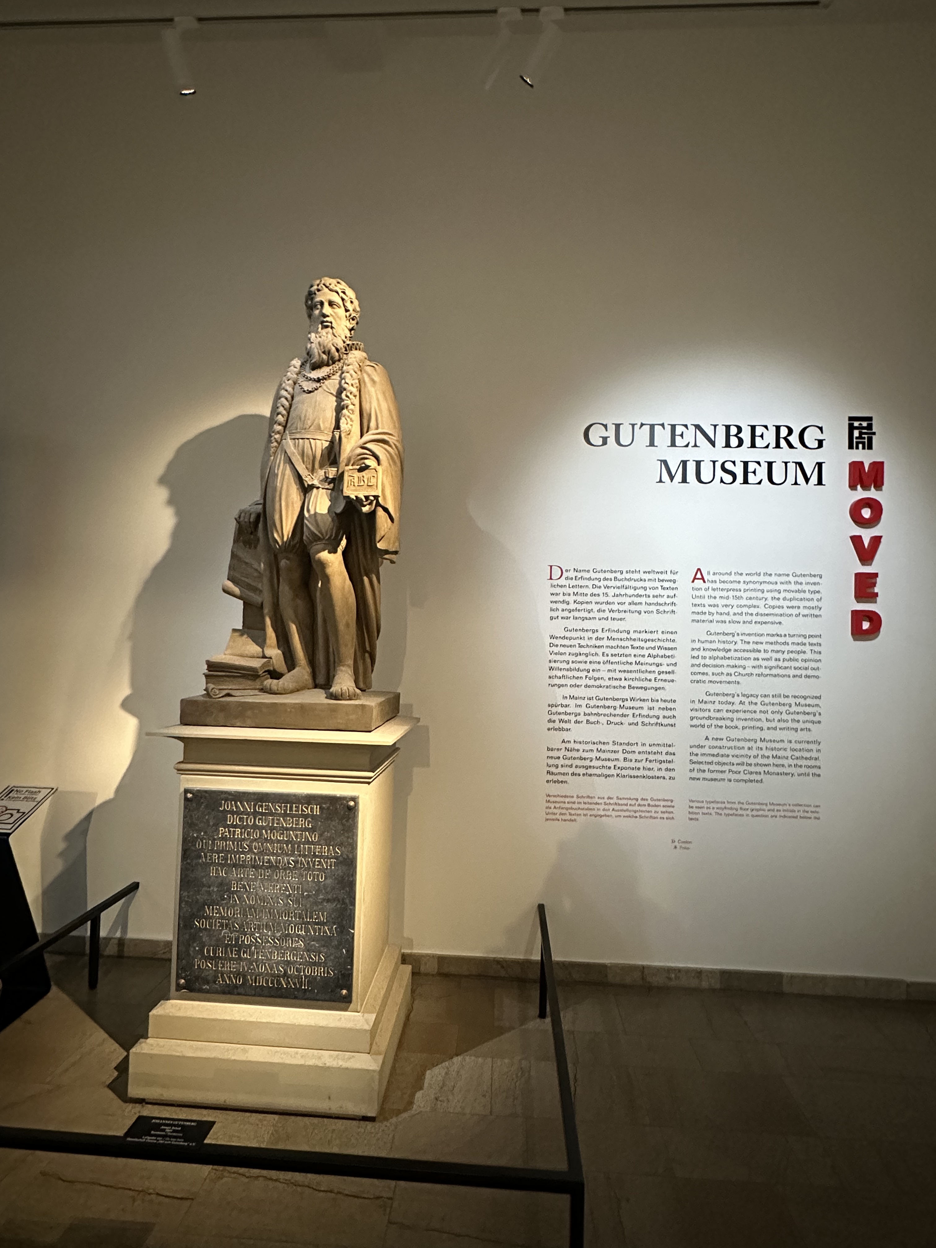
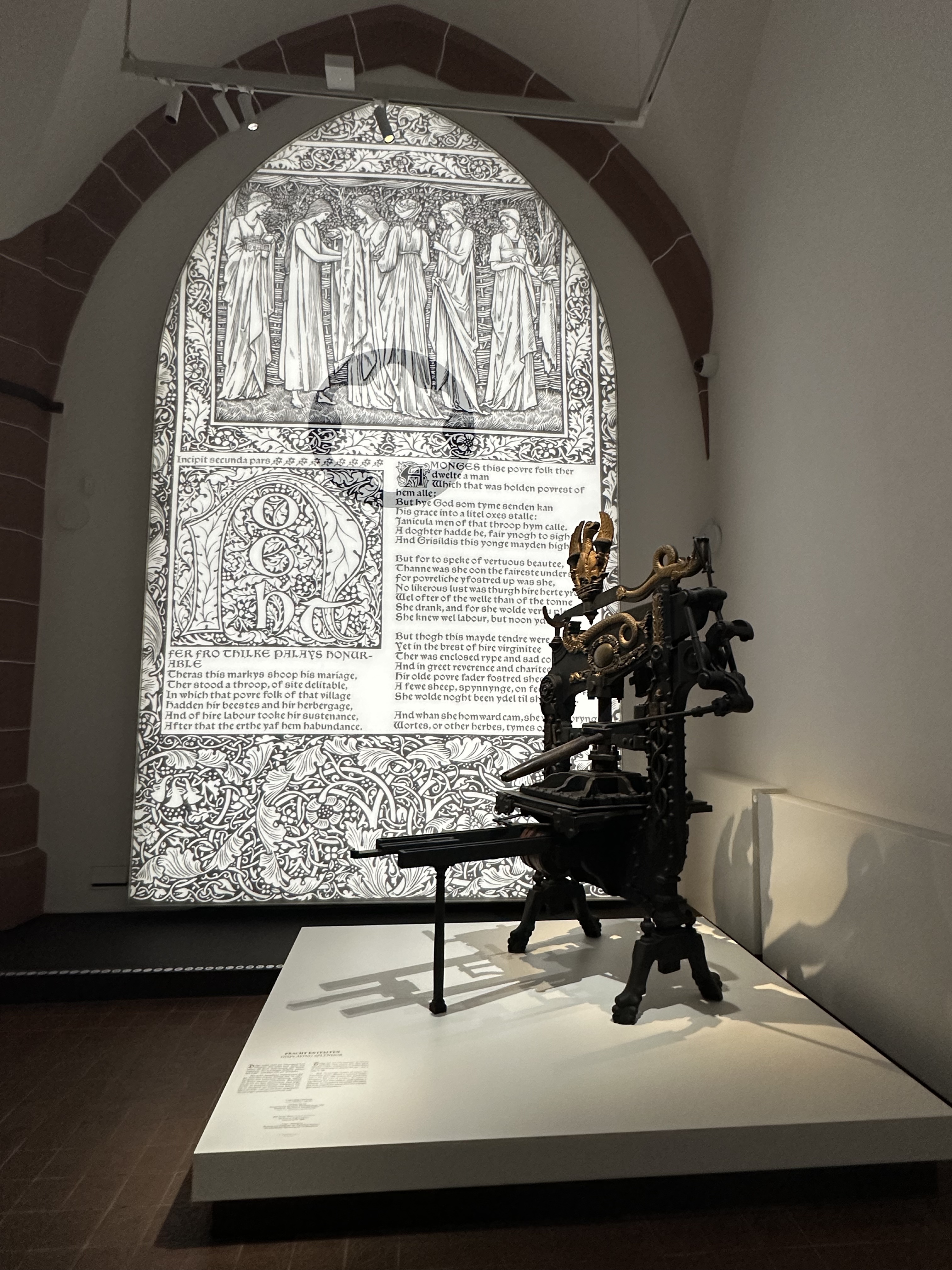
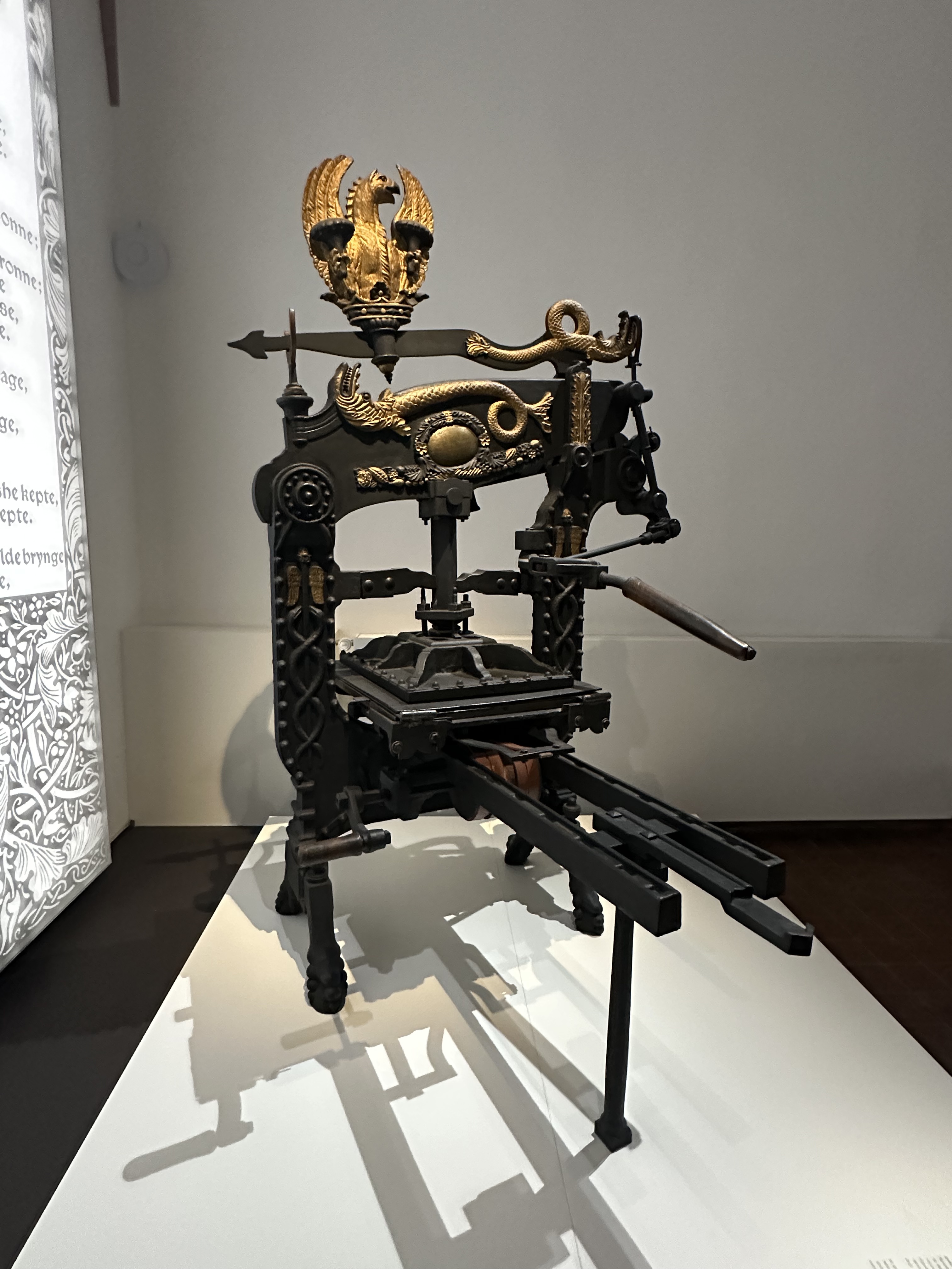
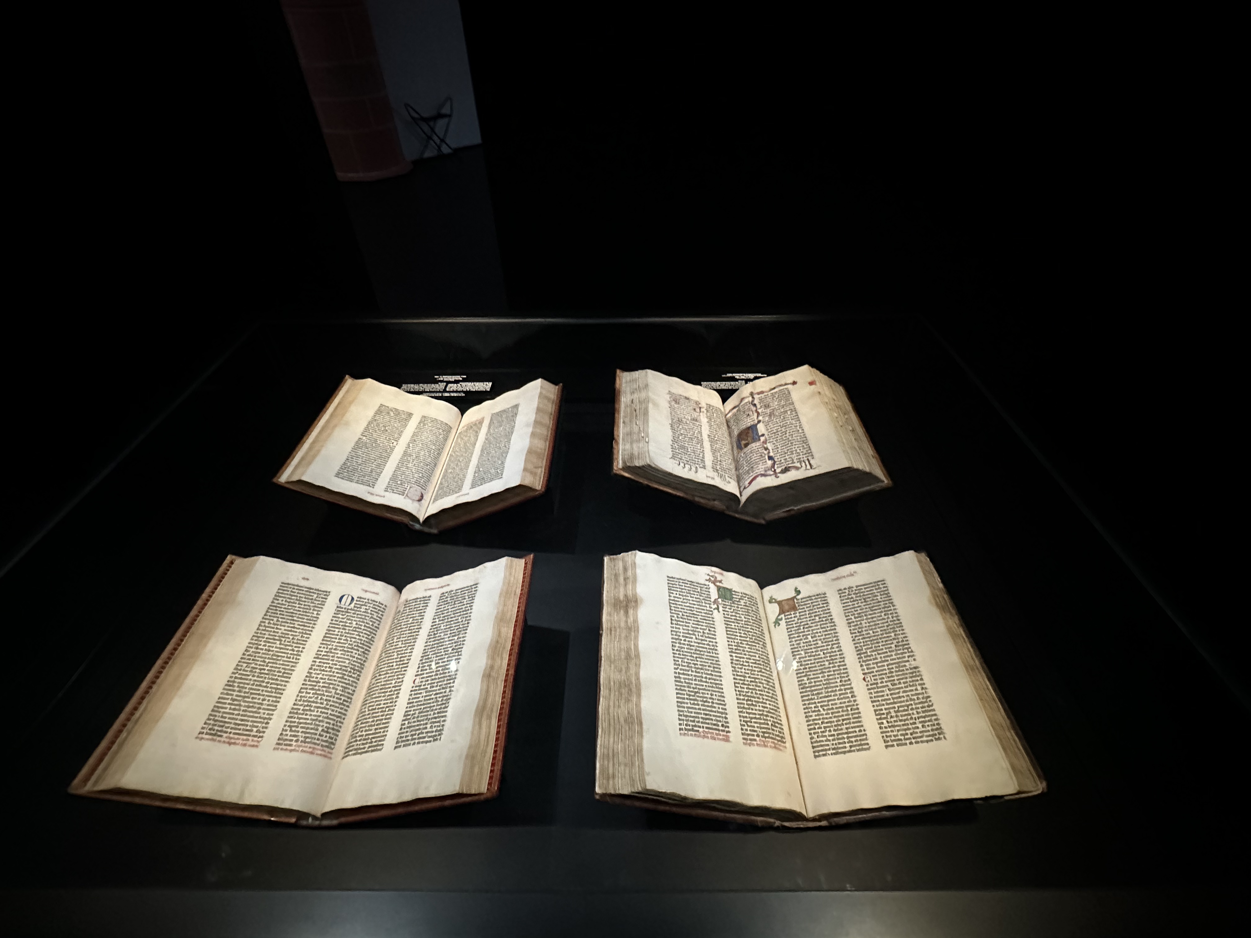
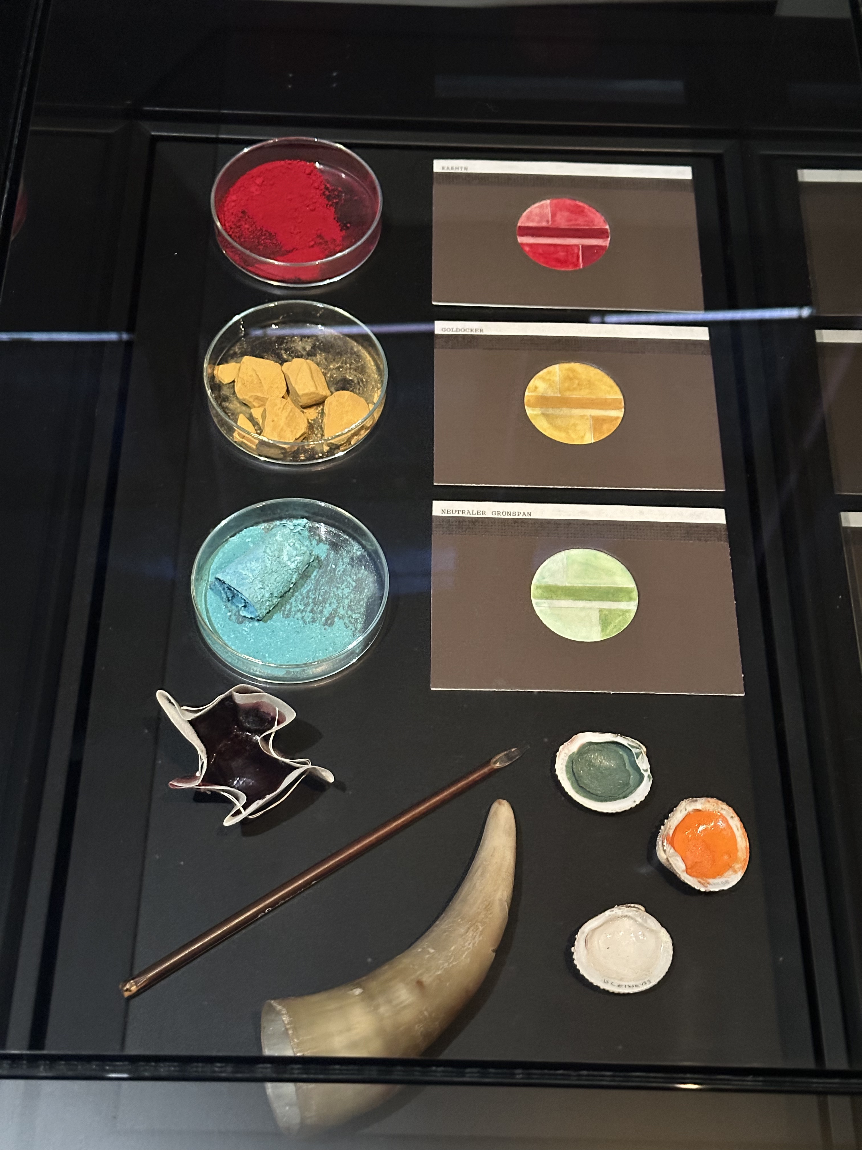
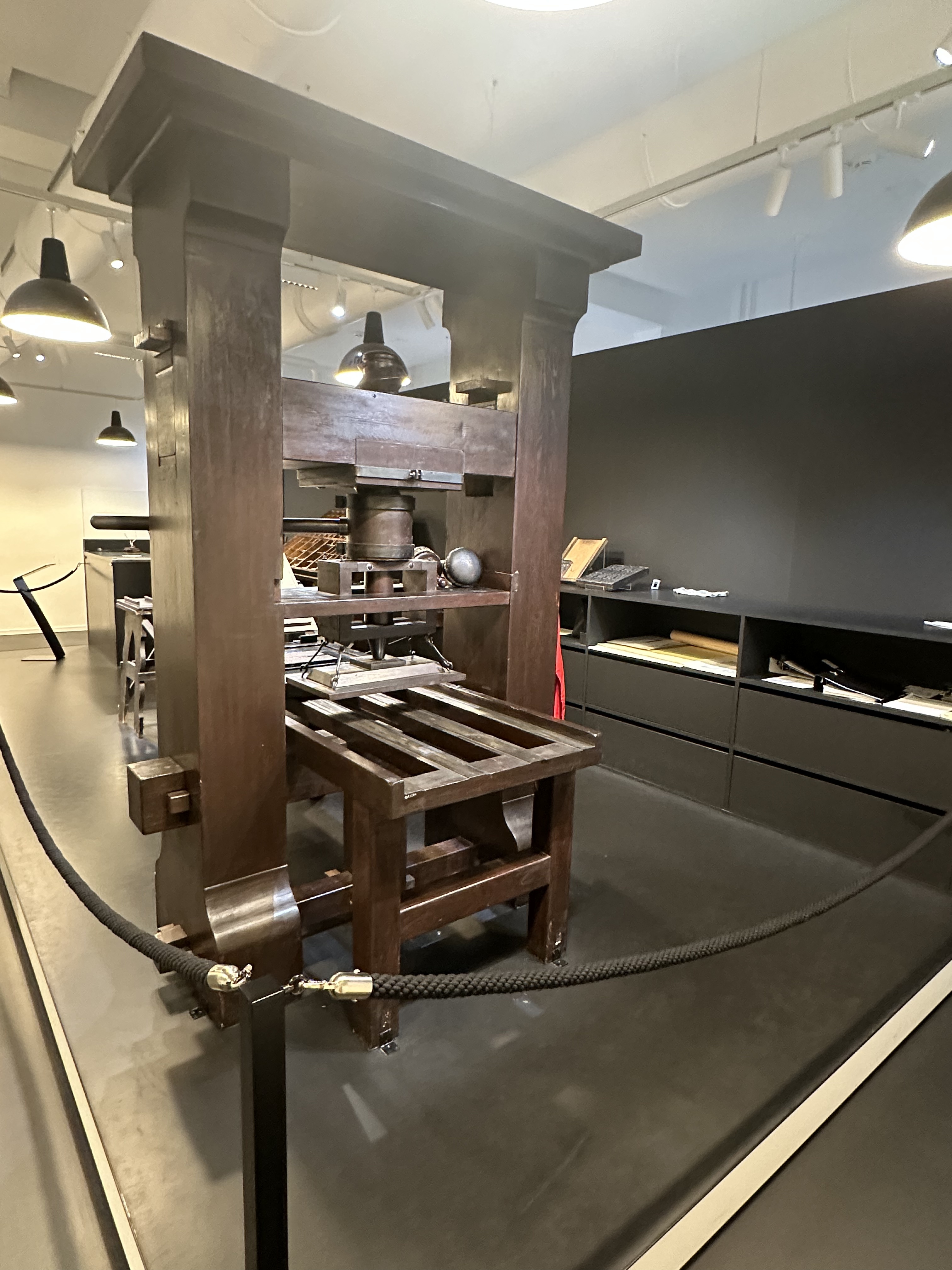
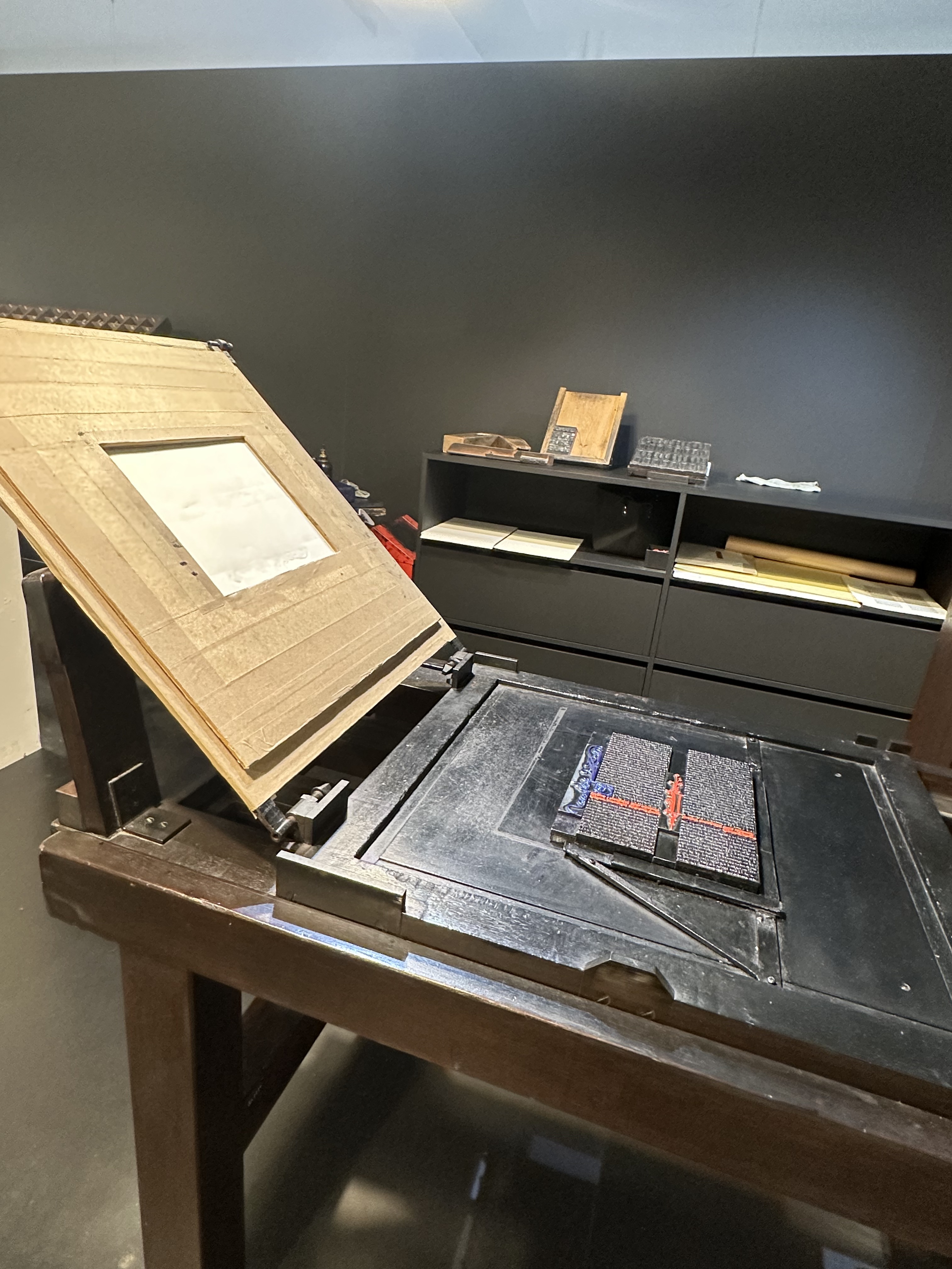
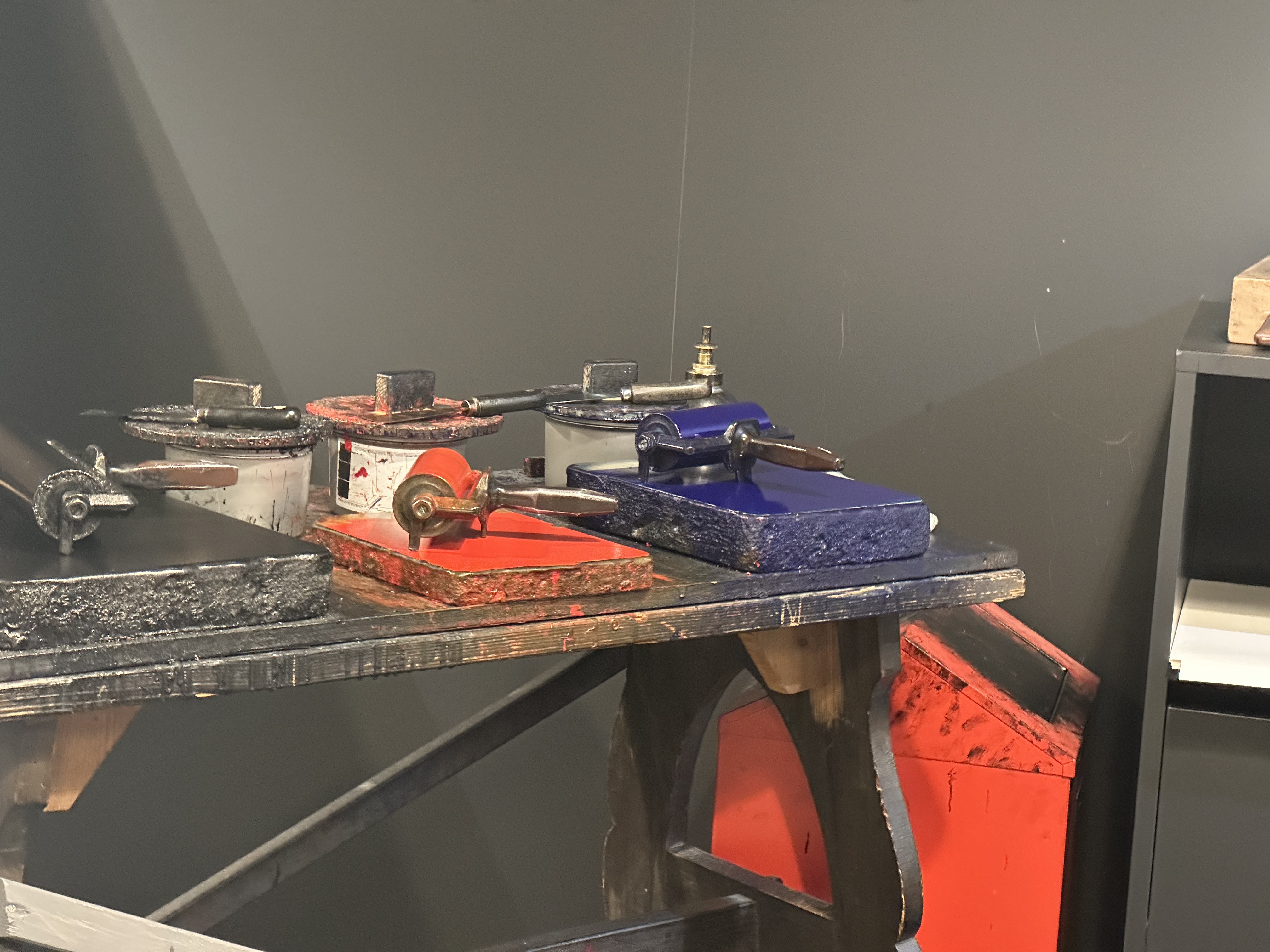
None of the devices there were from the 1400s. The original presses weren’t built to last for centuries, and maybe no one at the time knew how important they were. But a few of the original run of Gutenberg bibles do remain and they were on display in Mainz.
Upstairs, the museum had a room where you could do hands on work with inks and metal type. I had to make it to my flight, so I walked around and took some pictures.
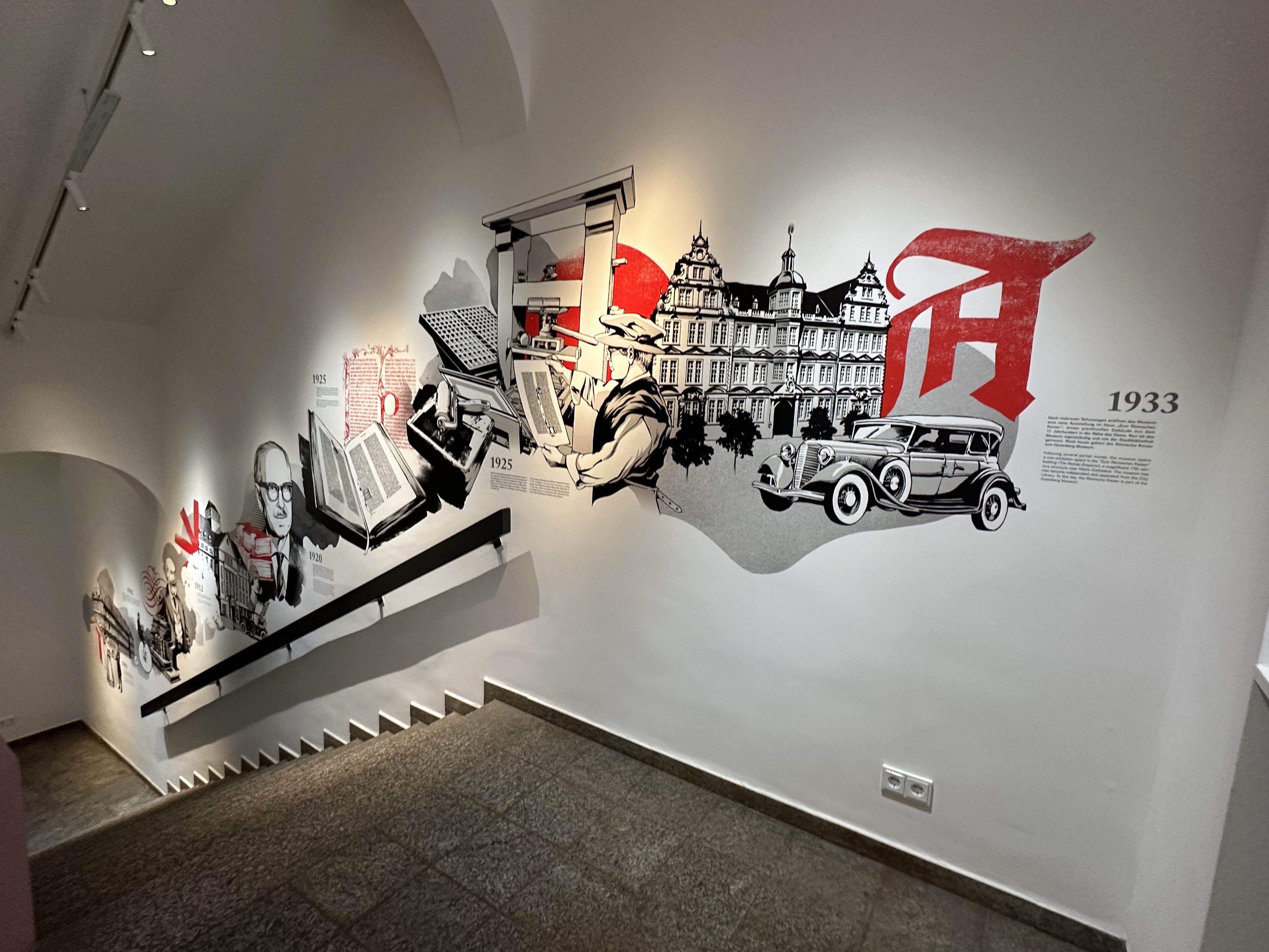
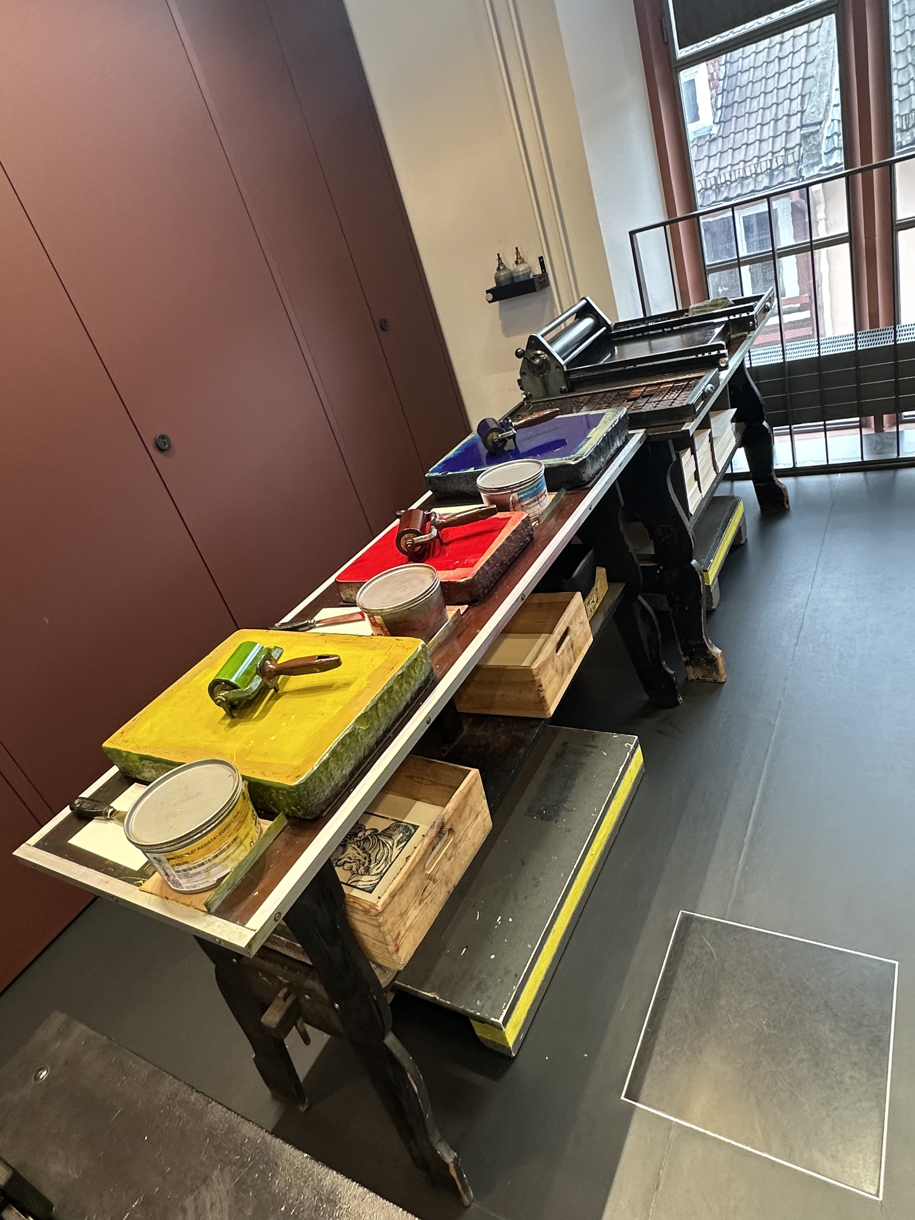
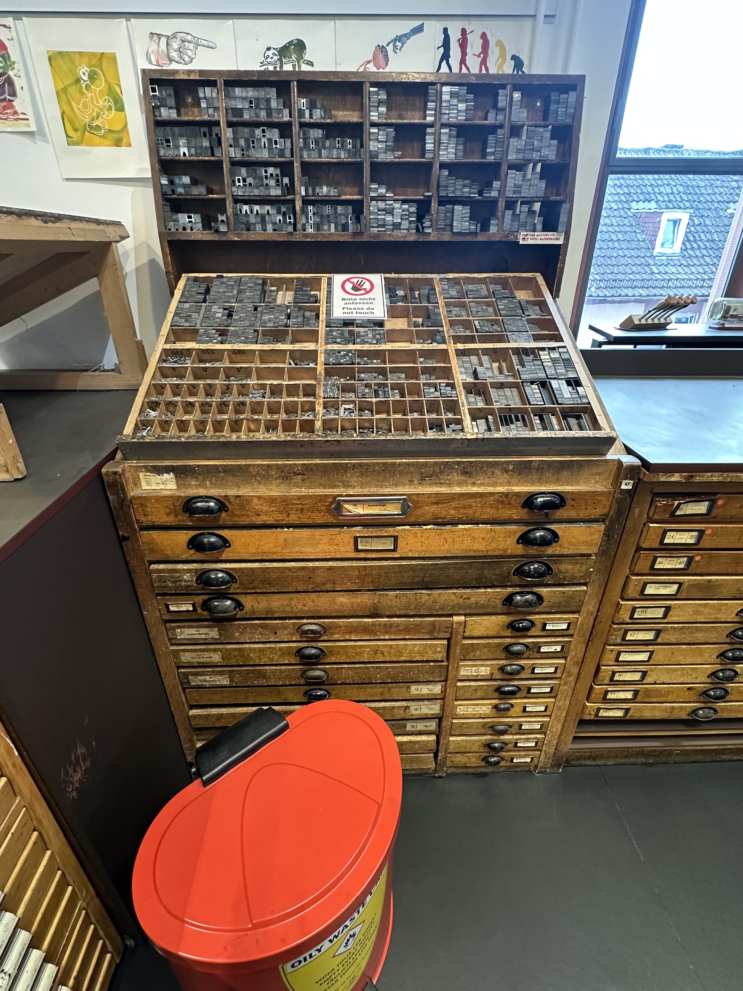
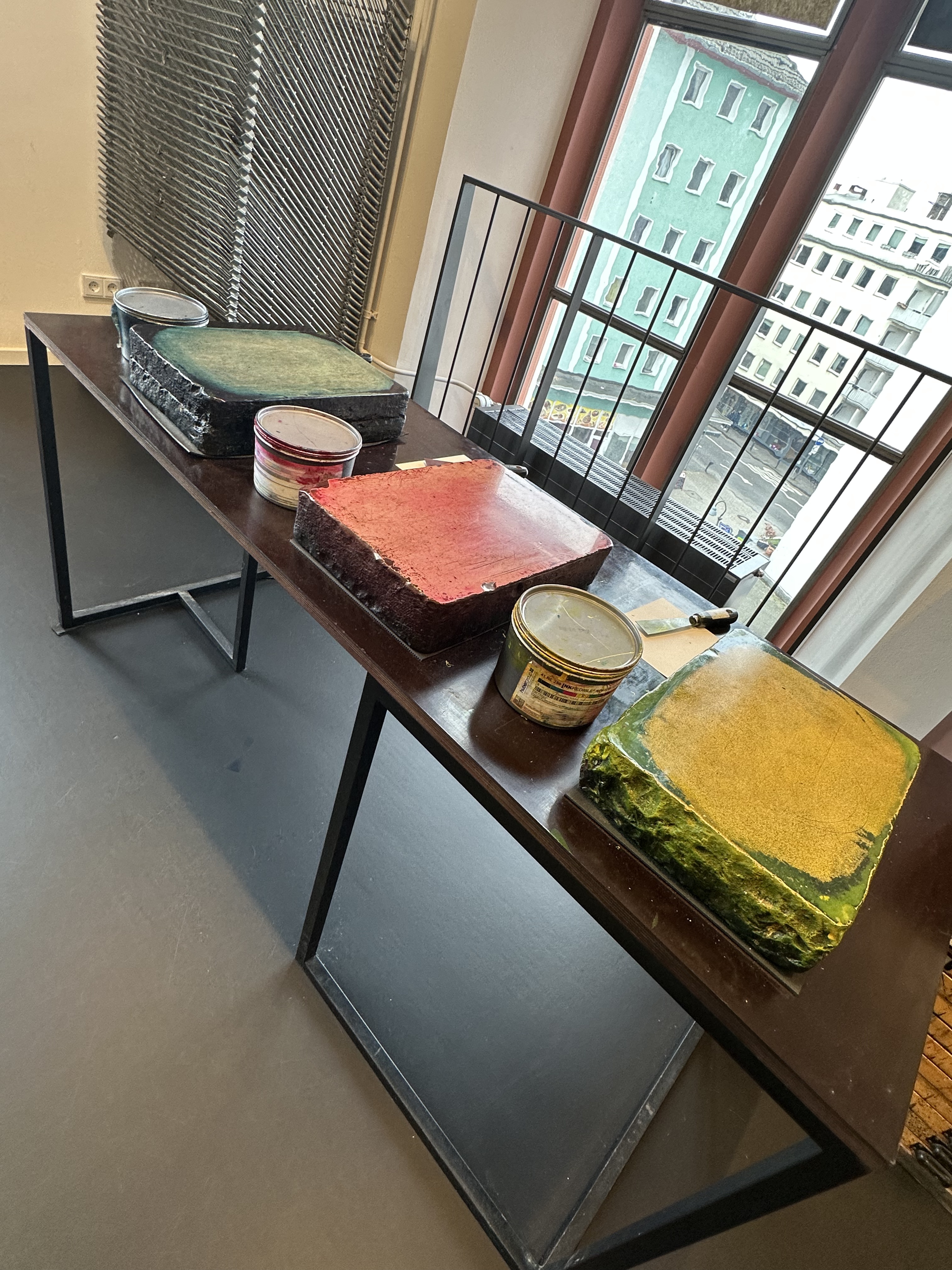
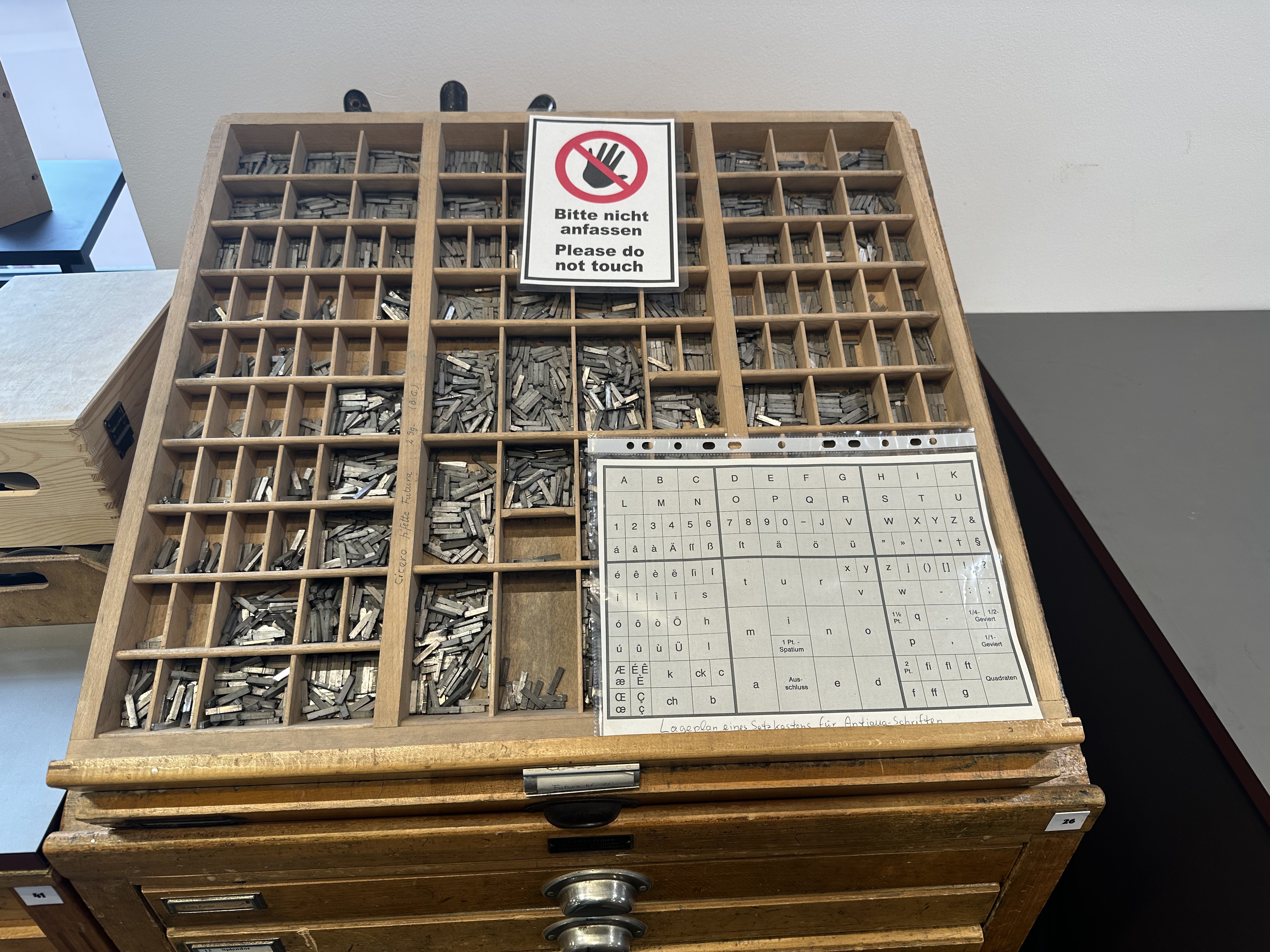
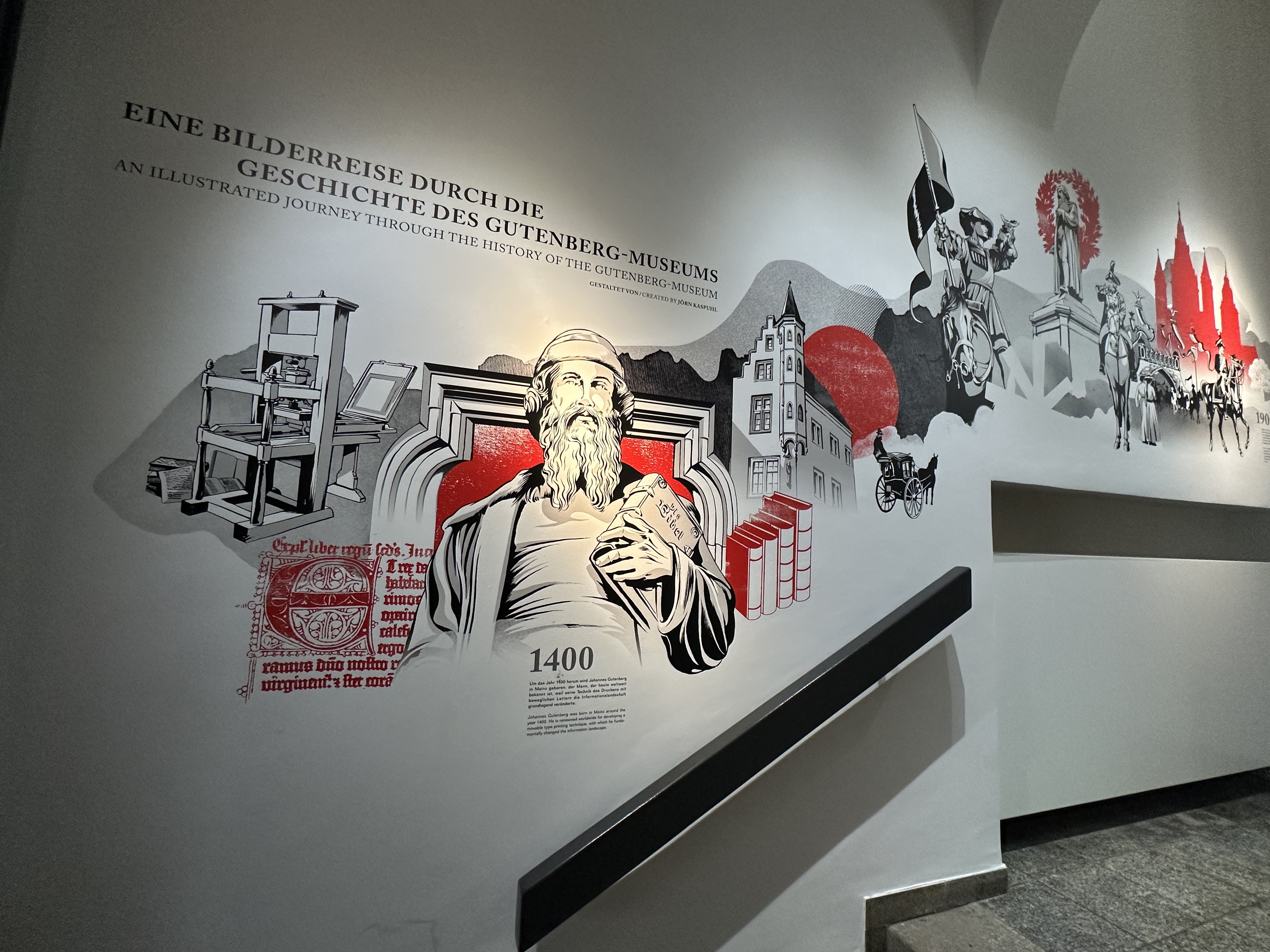
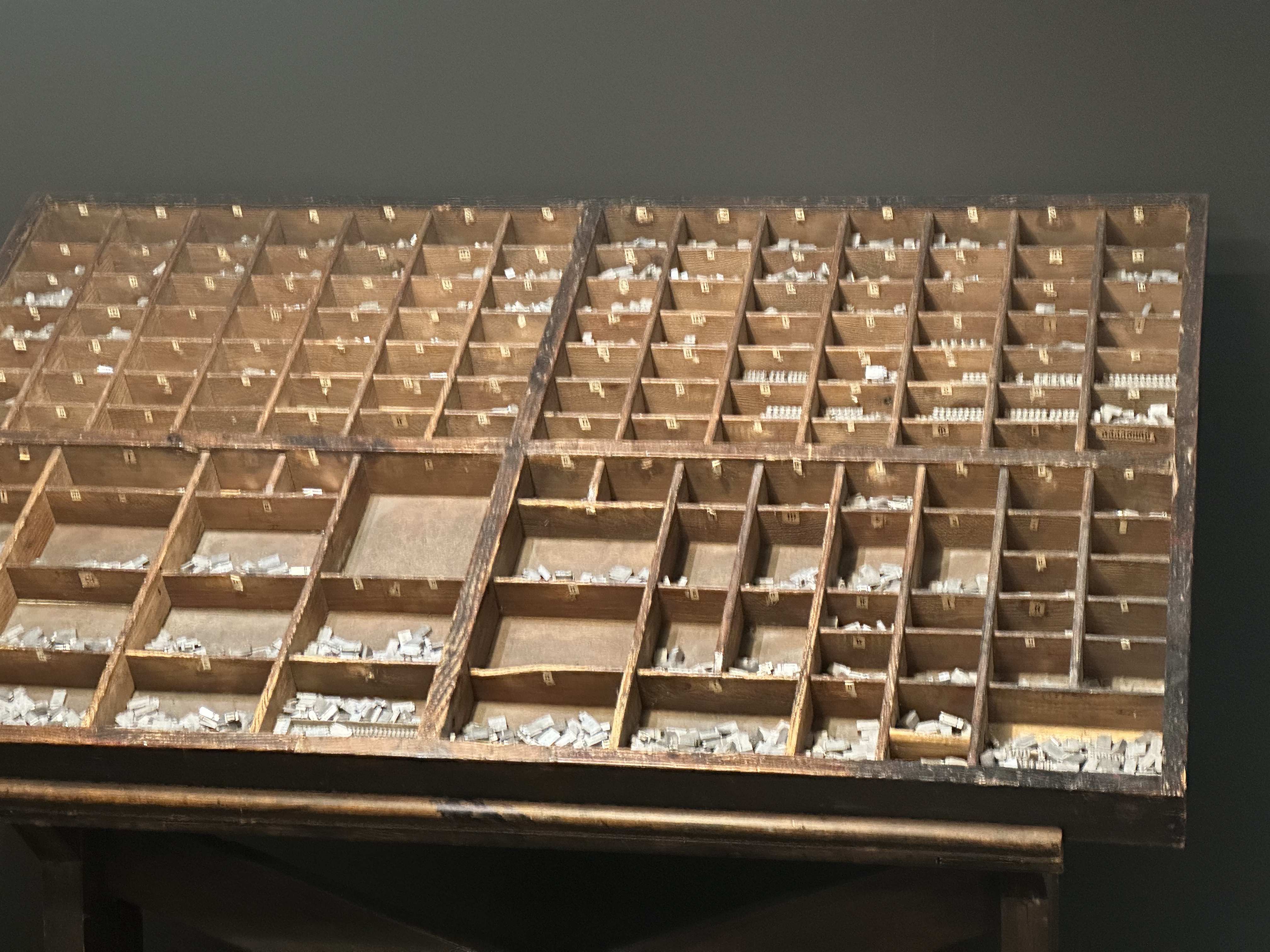
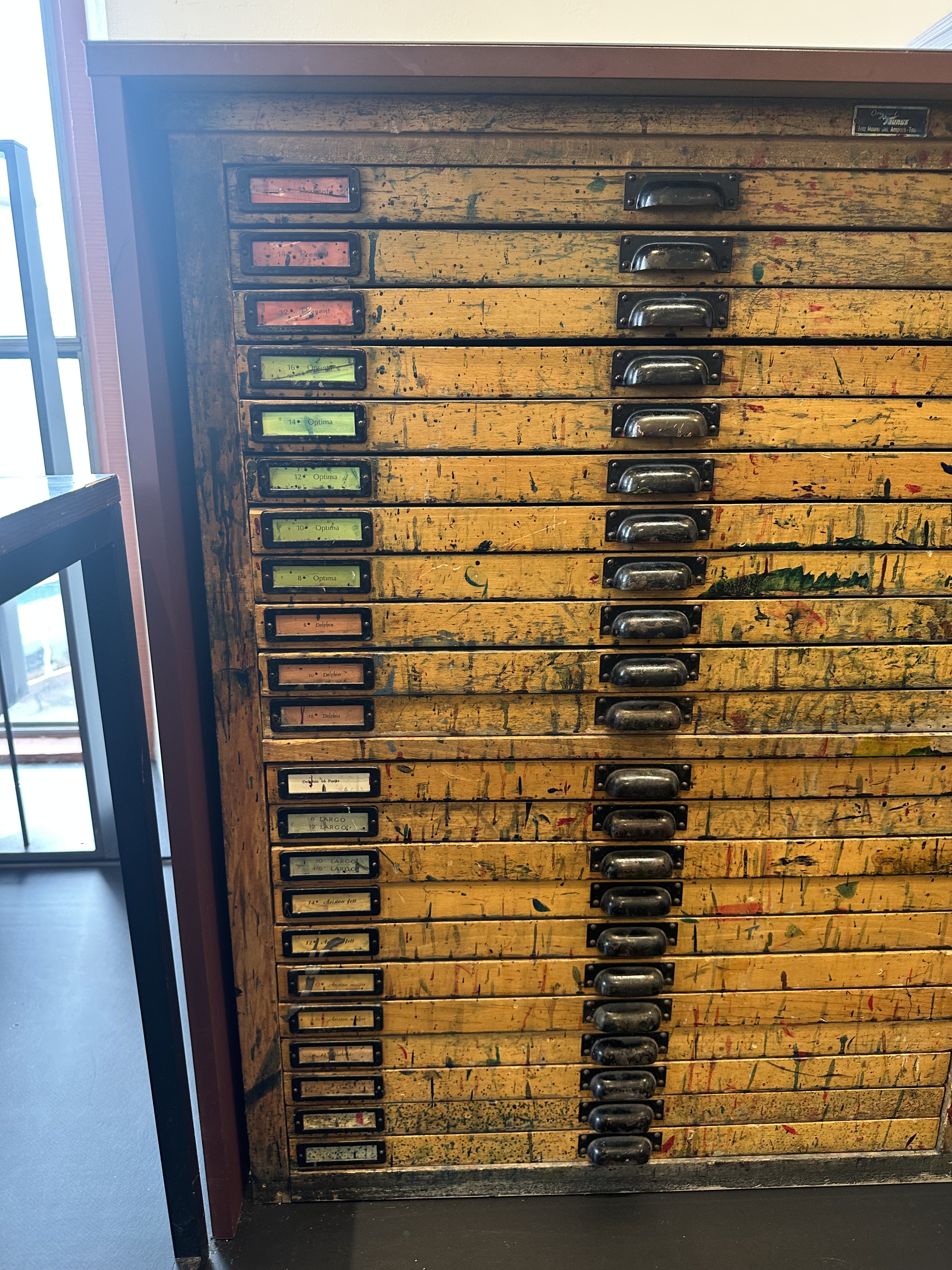
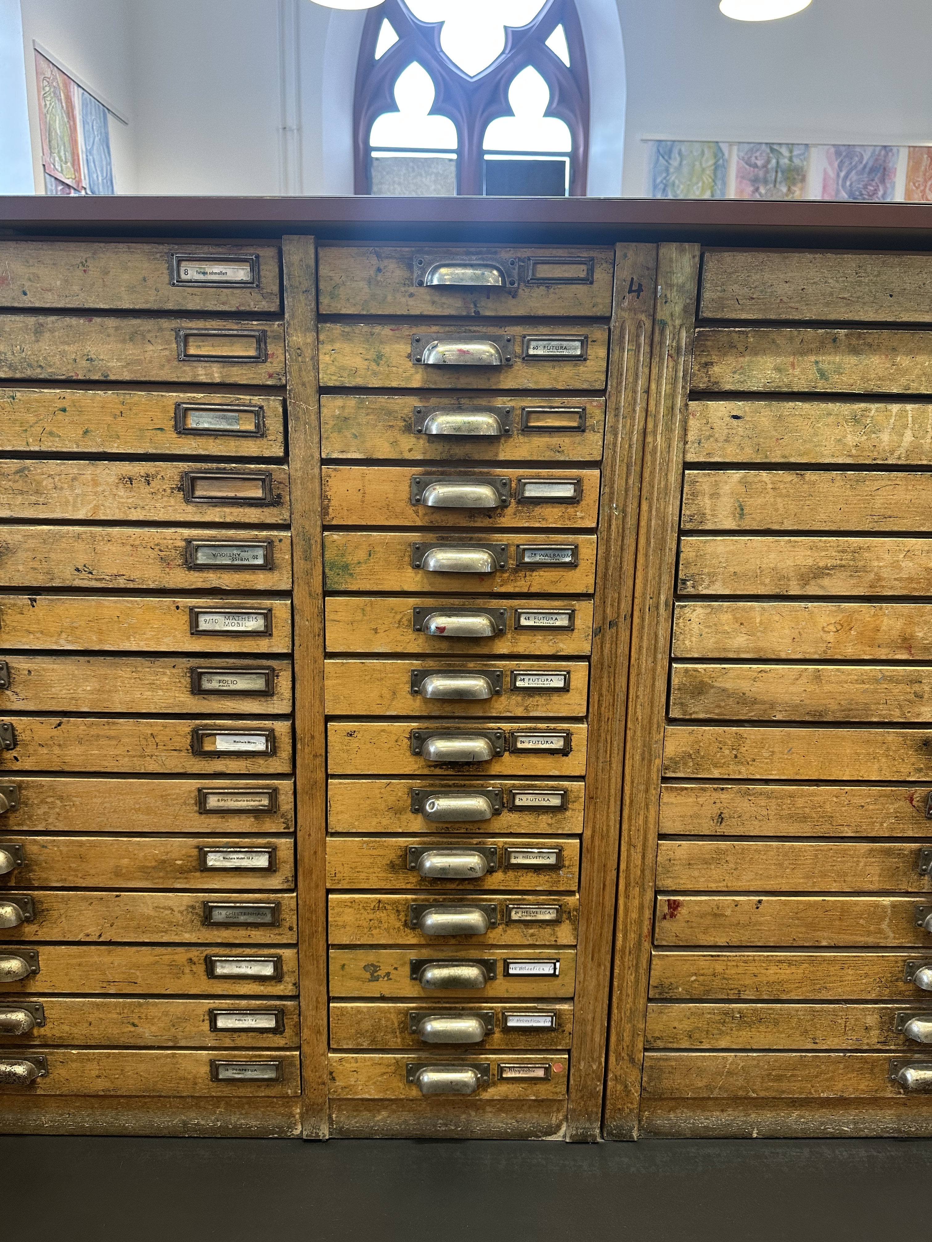
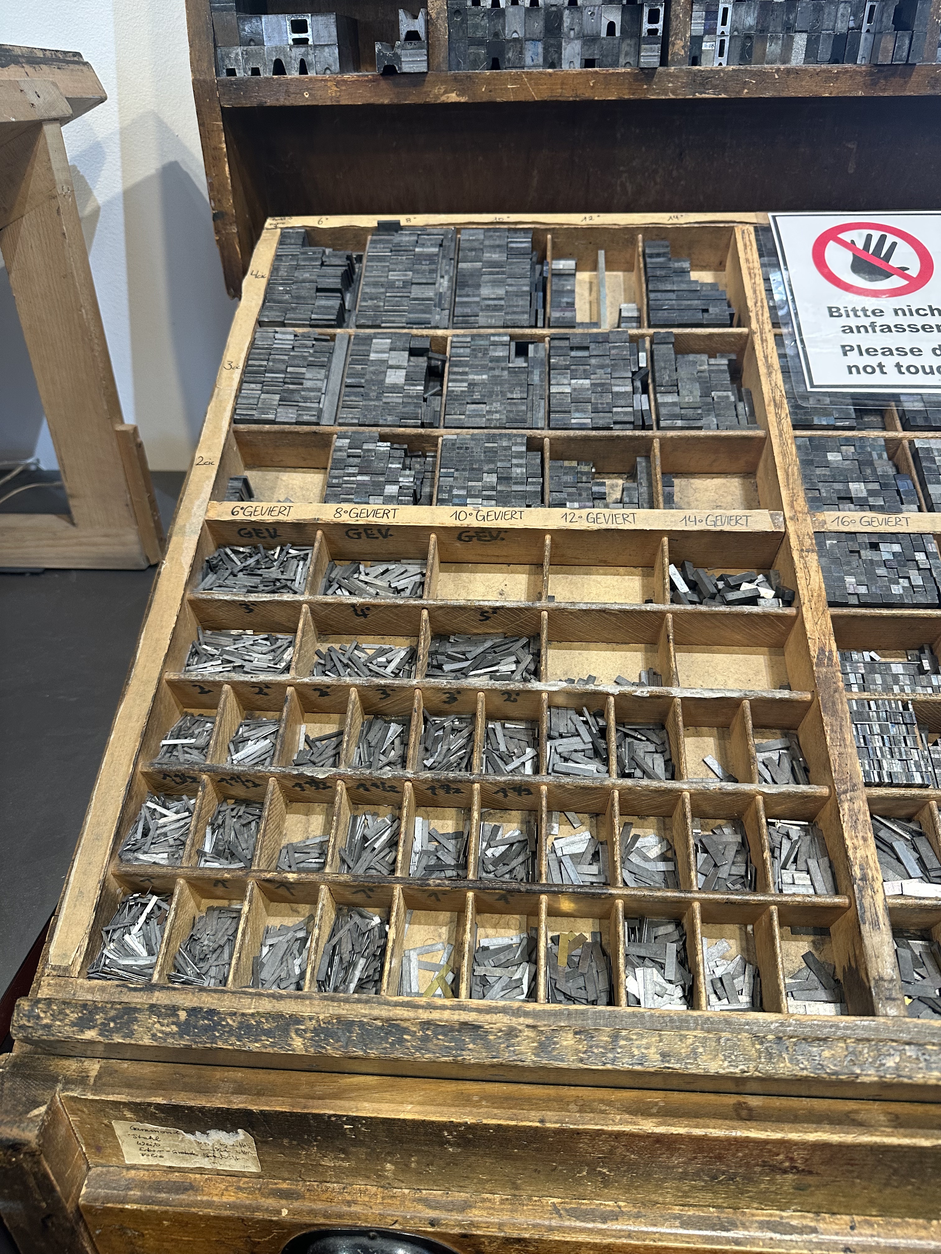
That was an amazing day.
You’d think typography doesn’t matter now that everyone flicks through websites and apps on their phones, but it does. In the book Practical Typography, Butterick points out how important highway sign font choices are. Highway Gothic, the 1940s font choice for U.S. highway signs, was carefully designed to fit different text lengths and for fast legibility at high speeds, but that was replaced by Clearview in the 1990s to improve legibility at night when bright retroreflective headlights cause letters to blur together. Type saves lives!
When we built the collaborative design platform Ceros in 2012, our engineer Rus converted fonts into JavaScript glyph functions that could render 20,000 characters as they were dragged across a multiuser canvas at 30 frames per second.
When I was in Mainz, one of the most talked about web technology breakthroughs was a TypeScript text layout engine called Pretext that was 300-600 times faster at measuring and laying out multiline text in a browser, including wrapping text flow around objects as you drag them.
And one of the global media companies we’re working with at VIP asked me to help make WordPress the core of their print workflows in addition to their digital publishing. I cannot wait to see what WordPress and modern AI can do for newspapers.
Thank you, Johannes!

